

Your voice and creativity shape how people discover WordPress.com. This guide will help you talk about and show the brand clearly, accurately, and confidently.
Use it to learn how to name and capitalize WordPress.com correctly, avoid common mistakes, and use official logos properly.
Understanding the WordPress ecosystem
WordPress.com, WordPress, and WordPress.org are easy to mix up. Knowing the difference is the foundation of representing the brand accurately.
WordPress.com is the all-in-one WordPress platform. It gives people real WordPress with hosting, security, and updates managed for them, across free and paid plans.
For a deeper explanation of how WordPress.com, WordPress, and WordPress.org relate, see Understanding WordPress.com and WordPress.com vs WordPress.org.
The rest of this guide focuses specifically on naming, capitalization, and logos.
How to refer to WordPress.com correctly
Getting the name right keeps your content accurate and helps your audience understand that WordPress.com is different from the WordPress software.
Correct usage
- Write WordPress.com in full.
- Always include the “.com.”
- Use the correct capitalization: WordPress.com, with a capital W and a capital P.
Common incorrect variations
- ✕ WordPress.com, with a lowercase “p”
- ✕ wordpress.com, with a lowercase “w”
- ✕ Word Press.com, with an extra space
- ✕ WordPress, when you mean WordPress.com
Why it matters
WordPress.com is the managed platform you’re promoting. WordPress is the free open source software that powers WordPress.com and many other sites. Using the right name keeps your content clear, accurate, and trustworthy.
Brand usage examples
Example 1
✓ Correct: WordPress.com offers all-in-one managed WordPress hosting.
✕ Incorrect: WordPress offers all-in-one managed hosting.
Why: WordPress.com is a hosting platform, like Bluehost or Pressable. WordPress is the software those platforms run.
Example 2
✓ Correct: I recommend hosting your site with WordPress.com.
✕ Incorrect: I recommend hosting your site with WordPress.
Why: WordPress.com includes hosting as part of the platform. WordPress is software and can’t host a site on its own.
Visual guidelines
Use official WordPress.com visual assets whenever you show the brand in your content. Consistent use of the logo makes your content accurate, professional, and recognizable.
Official logo
The WordPress.com logo comes in several approved variations. You can find them in the WordPress.com Brand Kit at the bottom of the Automattic Press page.
Always use logos from the official Brand Kit. Don’t use versions found elsewhere online, as they may be outdated, altered, or incorrect.
Logo use
Default to the full WordPress.com logo, which includes the complete WordPress.com name. It’s the most recognizable and preferred version.
When using the logo:
- Don’t alter, recolor, rotate, crop, or otherwise change it.
- Place it on a clean, uncluttered background.
- Make sure it stays easy to read.
The blue logo is the default and works best on light backgrounds.
The black logo suits neutral or minimal layouts.
The white logo is for dark backgrounds only, and shouldn’t sit over busy imagery.
When space is tight, you may use an abbreviated version of the logo.
Use the “W” mark only as a small supporting element, and not as the primary logo.
Use the wp.com abbreviated version of the logo only where space is tight.
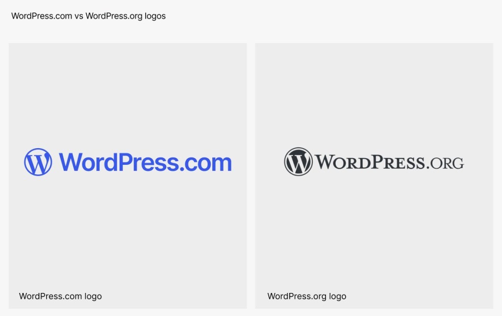
WordPress.com vs WordPress.org logos
The WordPress.com and WordPress.org logos look similar, but they represent different products.
Use only the WordPress.com logo when referring to WordPress.com. Don’t swap in the WordPress.org logo or use the two logos interchangeably.
In short
Representing WordPress.com accurately starts with the basics: use the full name, keep the capitalization correct, and use official visual assets. These details build trust with your audience and keep your content clear and professional.

